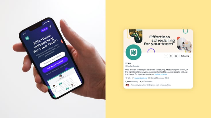
Say hello to the refreshed YCBM
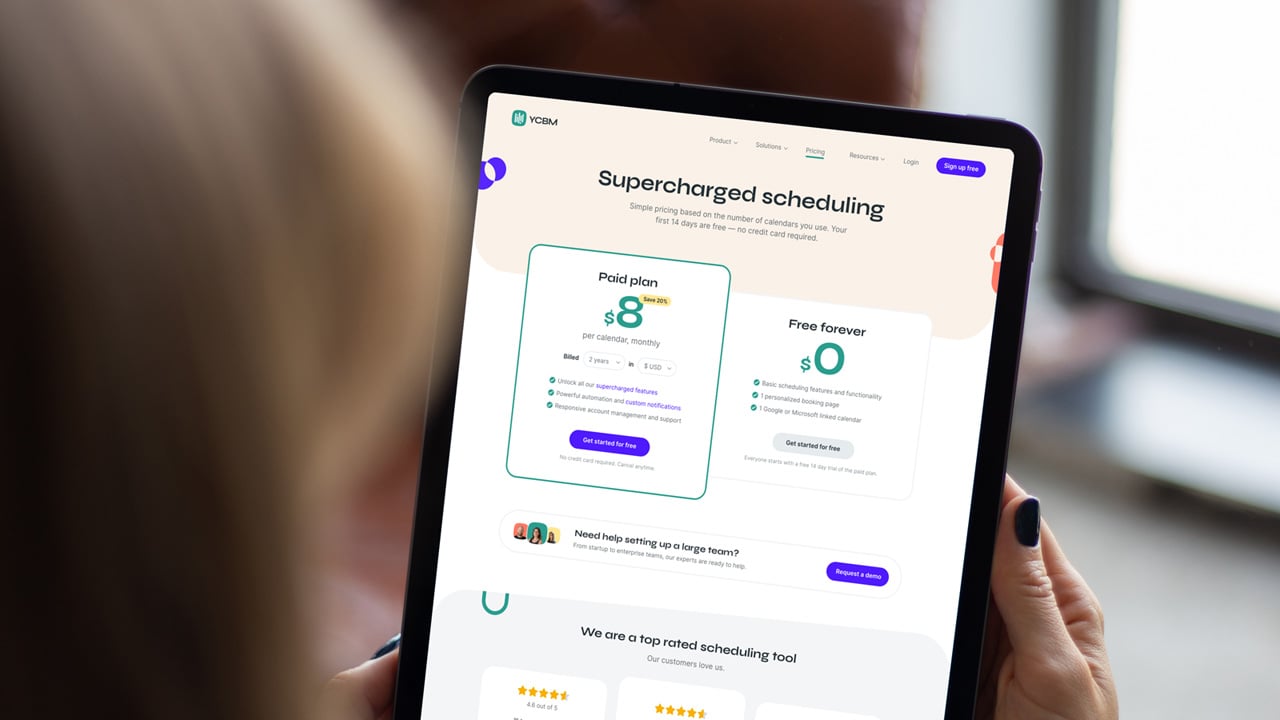
As you probably noticed, we’ve got a new look! Take a look at exactly what’s changed, why, and what that means for the future. P.S. We hope you love it as much as we do.
The YouCanBookMe team

Introducing a refreshed and revamped YouCanBookMe
As you may or may not know, YCBM has been solving scheduling problems for over 10 years! Although we’ve gone through various design iterations since we felt that now was the time to bravely face the future and modernize. So we did!
We loved our old look, and we know many of you did, too. That’s why it was so important to us to refresh the brand while staying true to our customers and target audience.
We're extremely proud that the refresh was created in-house by us. We're a small company that does big things, and this was right in line with our company culture.
Our existing style has been elevated by creating a refreshed, and more cohesive visual identity, inspired by all the themes at the center of our brand: calendar events, availability, and bringing people together.
Without further ado, let’s take a quick tour of what’s changed and why. Ready? Let’s go!
A brief history behind our revamped logo
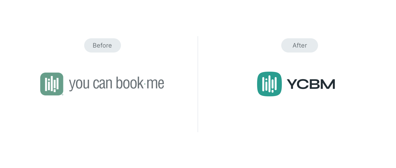
The new icon is an evolution of our original — with softer corners and rounded inner shapes. It brings our identity to life while retaining YCBM’s original concept and purpose.
In less dramatic terms: it’s revitalized, but recognizable, which was important to us.

Some of our eagle-eyed customers may have noticed that our original icon — created in 2011 — actually reflects the form of a calendar, with the inner shapes symbolizing events in a 5-day week. It’s a concept we love, and a part of our identity we were keen to retain.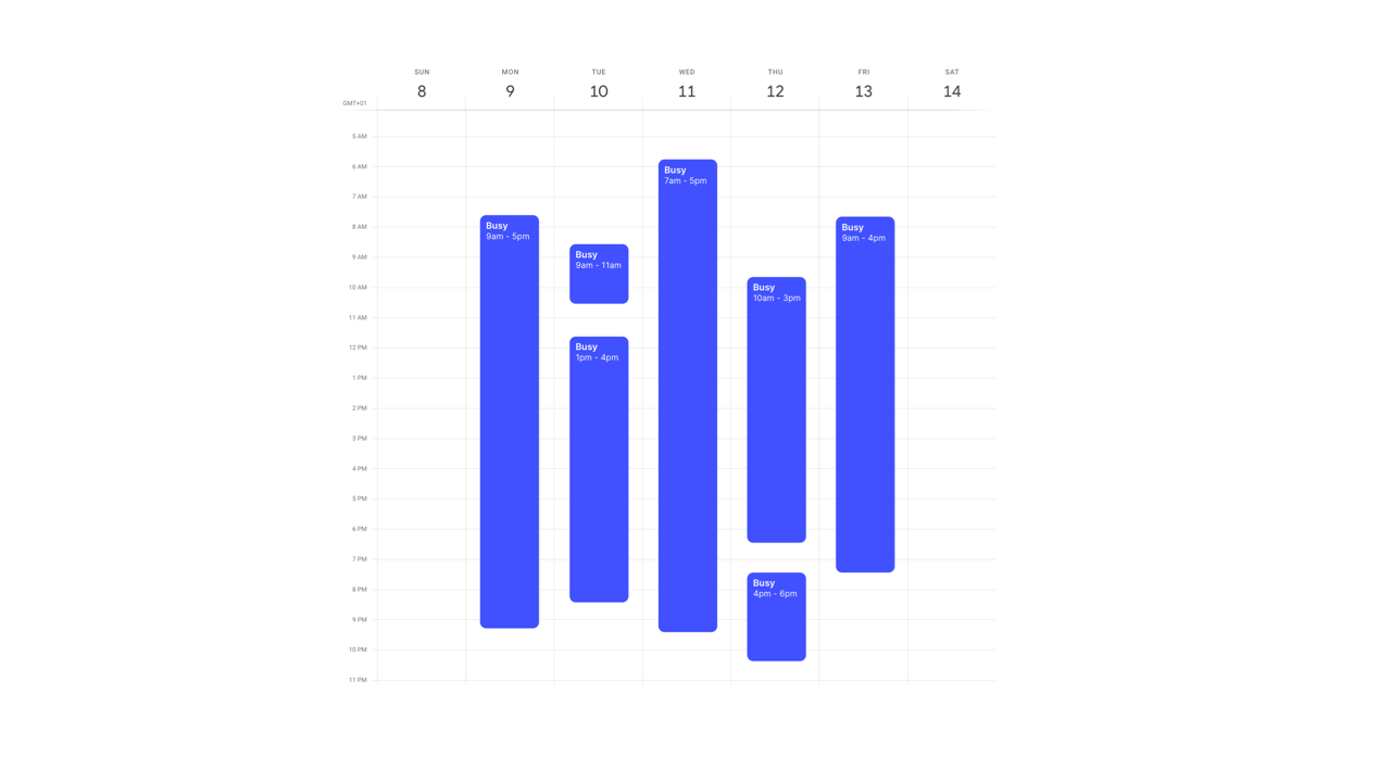
A simplified and bolder wordmark
We transitioned our wordmark to YCBM. Our company name has historically been interpreted in many different ways — from bookme to youcanbook. We’re hoping to bring some clarity with this change. You can call us YCBM or YouCanBookMe — we’ll happily respond to both!
Colors that catch your eye
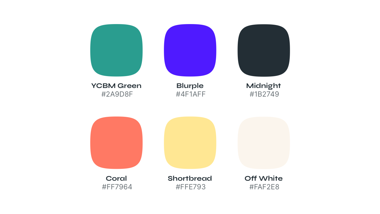
The YCBM green has always been a part of our brand. We feel connected to the color and what it represents: growth, energy, and new beginnings.
However, we felt that our green had started to look a little tired and dull, the exact opposite of all our future plans for YCBM. So we injected energy and excitement into it by brightening it up. It now fits a lot better into our expanded, super vibrant color palette.
It's a little bit like when Spotify changed their green — just less controversial.

Take a look at our smoother edges
We used the rounded shapes from our new icon to create a distinct visual theme throughout the YCBM brand.
The abstract shapes symbolize calendar events and shared availability, which is what our product is all about. There is an endless amount of combinations and compositions that can be made with the shapes, allowing us to be super creative, fresh, and modern.
You will notice that we have used them to frame up imagery, as well as UI decorative assets to enhance the experience and give an overall feeling of openness and possibility.
A new typeface
We wanted our new typeface to be bold and quirky so that you wouldn’t forget the time or place you first saw it.
We chose a font that would give us an extra punch and help us stand out when used across all different touchpoints. Something that again would represent the future of our brand and the direction we are heading in — modern, easy-to-use, and unique.

First step: brand refresh. Next step: stay tuned to find out!
Our new vibrant color palette, exciting shapes, and bolder typeface allow us to build a distinct identity that is more creative and playful.
Over the next few weeks, you’ll see our new style and visual direction appear throughout all of our products — our website, app, booking experience, social posts, advertising, and more.
Fear not, we’re still the same YCBM you know and love — we’ve just had a bit of a spruce up. We hope you love it as much as we do.
TL;DR
We did a Spotify and updated our green.
Subscribe to our newsletter
Get productivity tips, news, articles and resources.Written by
The YouCanBookMe team
We care... so we share. The YCBM team has a lot to say about online scheduling and improving productivity. We pay it forward with interesting articles, top tips, updates, and insights about how to be a scheduling ninja and a productivity pro!
Keep reading
7 Must-Have Coaching Software for Client Success
Streamline your business using these top coaching software, taking the admin tasks off your plate so you can focus on helping your clients become the best version of themselves.
Read bloge1f6.jpg)
Schedule Smarter: 7 Doodle Alternatives to Consider in 2024
On a quest to find the best scheduling tool for your team? Check out the seven best Doodle alternatives, all designed to help you save time and hassle!
Read blog
4 Reasons Why YouCanBookMe Is Better Than Calendly
If you're a small business that truly care about your customers, Calendly isn't the right scheduling tool for you. See why YouCanBookMe is better than Calendly on four major fronts.
Read blog
