How to make appointment scheduling a 5-star customer experience

Now, I hear you asking “Aren’t I already doing that by offering the convenience of online appointment scheduling?” Not necessarily. 

It’s not about whether you provide online scheduling, it’s about how you do it.

Simply offering a booking page doesn’t automatically mean you’re giving customers a great experience.

If your appointment scheduling system is clunky, difficult to navigate, or too generic, it could turn customers off. 

Here are five proven tips to ensure your customers love booking time with you and want to come back again and again

What does easy online scheduling look like?

Take the tour

Gone are the days when being able to schedule someone online, without having to wait for opening hours or endure the back and forth of finding a time, was a novelty.

Back then, just having control over how and when they scheduled was incentive enough for most customers to tolerate badly designed scheduling sites. 

Today it’s clear that there is a big difference between providing an easy online appointment scheduling option and making appointment scheduling a great experience

And that difference could mean happier customers, more productive colleagues, better engagement, and higher sales. 

Isn’t just offering online appointment scheduling enough? 

Not anymore.

Organizations and businesses are competing for the eyes and dollars of customers around the world.

Providing a personalized - and personable - experience is key to helping you stand out. 

You put a lot of effort into creating your business, defining your brand, understanding your customers, and developing relationships with them.

Your unique “you-ness” is why someone considers buying from you, and why they remain a customer. 

After you’ve done all that work, the last thing you want is for your online scheduling tool to be generic, inflexible, and impersonal. 
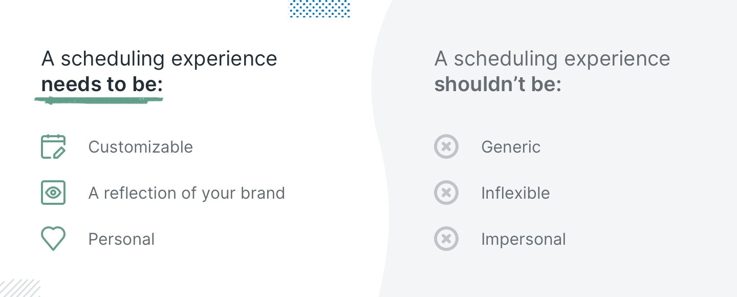
What an appointment scheduling should be


Whether customers are seeing your scheduling page embedded directly into your website or if they are clicking on a link, you want it to feel as much a part of your business like everything else.

Don’t let mismatched branding or non-specific language confuse them, or make them question if it's legitimate. 

So how can you make sure that when someone schedules time to meet with you, they are having the same great experience and the same kind of communication, they would have if they were speaking with you in person?

Keep reading!


1. Customize your branding

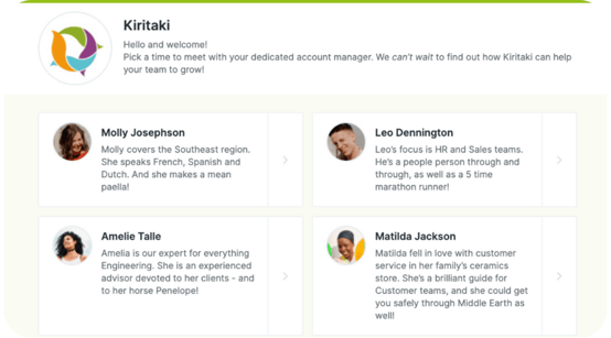
Your YouCanbook.me booking page can be customized exactly as you need it. Add your brand color so it matches your other website pages.

Add a logo or your photo. Or both! 

YouCanBook.me booking page example

Add a title, introductions, and instructions using your own language and reflecting the personality of your business.

Have it the way you want it - remember, they are scheduling with you, not us! 

2. Make it easy to use

💡 Fun fact: 88% of customers are less likely to return to a website after a bad experience. And customers are willing to pay more for a better experience.

Create a simple, accessible layout

A big part of ease of use is making sure your booking page is easy on the eyes, with readable and accessible fonts.

Customers appreciate a format that guides your booker through the process with easy navigation and as few clicks as possible to complete the process.

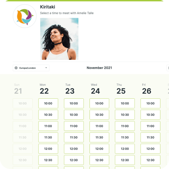
YouCanBook.me booking experience

YouCanBook.me’s layout offers the most simple and uncluttered booking page available. Fonts and spacing make a clear, easy-to-read page.

Bookers are guided through the process with easy-to-spot pointers to the next step. 

When selecting a time, you see a week-view with all the available times. The streamlined navigation means the booking is a quick and easy experience. There are no extra clicks created by having to select the day first, then the time. 

Our pages are WCAG 2.0 compliant and we continue to work with customers to ensure everything is accessible on e-readers and other assistive technologies. 

Ditch the spinner 

The fantastic copy you created on your website has prospects excited and they want to know more. So they click on a page to schedule a meeting with your sales team. 

Don’t make them wait! 

No one wants to waste time or effort watching a spinner trying to load a webpage. Fast load time is crucial for getting prospects to commit to a call while they are most interested and for keeping a customers’ attention.

3. Personalize your communications

💡 Fun facts: 84% of consumers say being treated like a person, not a number, is very important to winning their business. And emails with personalized subject lines are 26% more likely to be opened.


Create a seamless, personalized experience

If your customer is on your website and clicks a link to book with you, use the information you already have to create a seamless experience.

YouCanBook.me’s smart links mean you can pre-fill the information you already know

  • Have they logged in somewhere, or downloaded a blog post? No one likes to repeat themselves. Pre-fill their name and email address into the booking form!
  • Is your customer booking after a conversation with a member of your team? Create a special link that pre-selects the team member, or the type of appointment they need, so the booking automatically routes to the correct person
  • Create conversational emails & SMS specific to the booker and the type of appointment they chose

YouCanBook.me offers fully customizable booking form questions, emails, and SMS

On the booking form, ask the questions you want to get the information you need.

Flexible formatting includes hidden questions which let you pass customer or team member information into YouCanBook.me, so you can send related data into your CRM, without the booker seeing it. 

Inject your brand personality into your emails and SMS. Your interaction with your customers is part of your brand style, so there are no “standard replies'' here!

You can continue to use the information from those smart links, and from any other answers on the booking form, in the communications that you send about the appointment. 

Shorthand codes and Conditional Statements are two YouCanBook.me hero features that will make you stand out! 

  • Personalize your greetings by using their name, company name, duration, and location options. 
  • Give bespoke instructions depending on the type of meeting they chose, the selected team member, or the location.
  • Give customers different options for meeting location and send through details based on what they choose.
  • Send follow-up emails that refer to what you talked about or where you met.

4. Don’t get lost in translation 

💡 Fun fact: 72% of consumers would be more likely to buy a product if the information is presented in their language

With increasingly global business operations, we can’t just assume that everyone can, or wants to, think in a second language. 

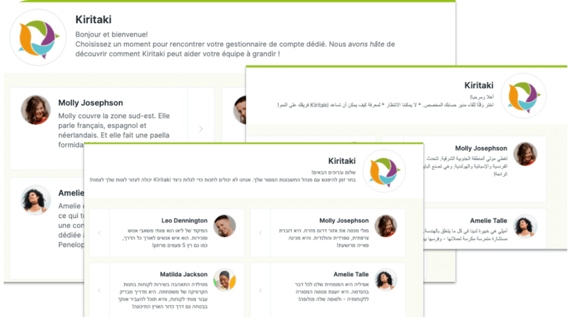
If your prospects or customers are located in different countries, you can create individual booking pages that are fully translatable in 24 languages. Right to left languages are fully supported.YouCanBook.me supports different languages
By translating your booking pages and adapting them to local preferences, you open your business to more potential customers and they can be confident that you understand their cultural needs

5. Be available on the go

Fun fact: 92% of people who can access the internet worldwide, do so using mobile devices.

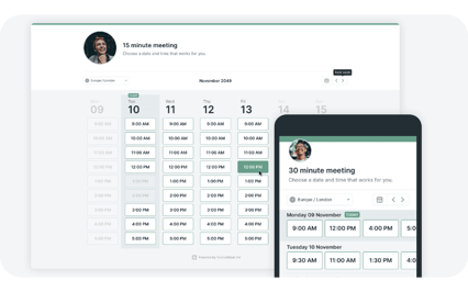
Mobile devices are where your customers are. Make sure they can reach you when they need you by providing online scheduling that works beautifully on mobile devices. 

YouCanBook.me’s booking pages are designed specifically for use on mobiles.

We’ve seen a 20% increase in bookings compared to previous page designs.

How to make appointment scheduling a 5-star customer experience

TL;DR

Offering easy online appointment scheduling is a smart decision for any business.

Customers want convenience and a majority say they would welcome a business introducing technology - as long as it will improve their experience.

With YouCanBook.me you get the best of both: simple scalable online scheduling that delivers a fantastic experience for your customers, no matter where they are.

Try YouCanBookMe today

Create your free booking page today. No credit card required.

Start for free See how it works

Get started for free

You can activate a 14 day trial of our paid plan at any time.
After your trial, enjoy our free version — forever.

Create your own booking page
No credit card required Free forever Upgrade anytime

Keep reading

coaching software to use in 2024
Blog

7 Must-Have Coaching Software for Client Success

Streamline your business using these top coaching software, taking the admin tasks off your plate so you can focus on helping your clients become the best version of themselves.

Read blog
Doodle Alternatives
Blog

Schedule Smarter: 7 Doodle Alternatives to Consider in 2024

On a quest to find the best scheduling tool for your team? Check out the seven best Doodle alternatives, all designed to help you save time and hassle!

Read blog
why youcanbookme is better than calendly
Blog

4 Reasons Why YouCanBookMe Is Better Than Calendly

If you're a small business that truly care about your customers, Calendly isn't the right scheduling tool for you. See why YouCanBookMe is better than Calendly on four major fronts.

Read blog